How do politicians distort comparisons with charts?


by Emily Cheung, HKBU

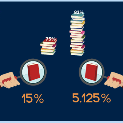
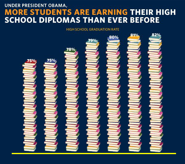
Data visualization is commonly used in political world. Politicians make use of various tools to visualize data, such as election votes, political achievements, and public satisfaction they gain. However, some data are presented in a misleading way that creates an overrated illusion.


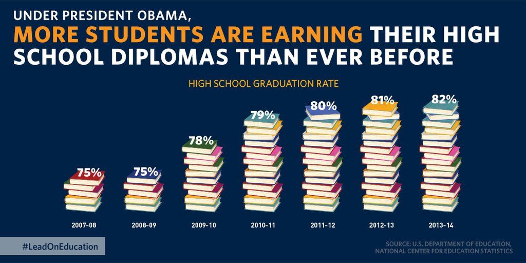
Does the high school graduation rate increase that much?

On 16th December 2015, the White House tweeted a post, saying that under president Obama, the number of high school diplomas owner has reached a new peak. The pilled books in the chart make the fact into a much more shocking one, but at the same time, it shows a myth of visualization.


DIFFERENT SCALE

The columns representing high school graduation rate in different years are in wrong scale. For example, 1 book in 2007 – 2008 column represents 15% of high school graduation rate, but 1 book in 2010 – 2014 column just represents 5.125% of high school graduation rate that year. It misleads the audience with a larger amount of book.


NOT STARTING FROM ZERO

When the chart is not start at zero, it creates an illusion that there is a significant growth throughout the years. But when we use 0 as a starting point, we can notice that there is only a small growth.